Intro to Web Development

Today

  • Add blog posts
  • Style our website to be responsive
  • Discuss Next Steps

The Inspector

To open the inspector, right-click on the website and select "inspect".
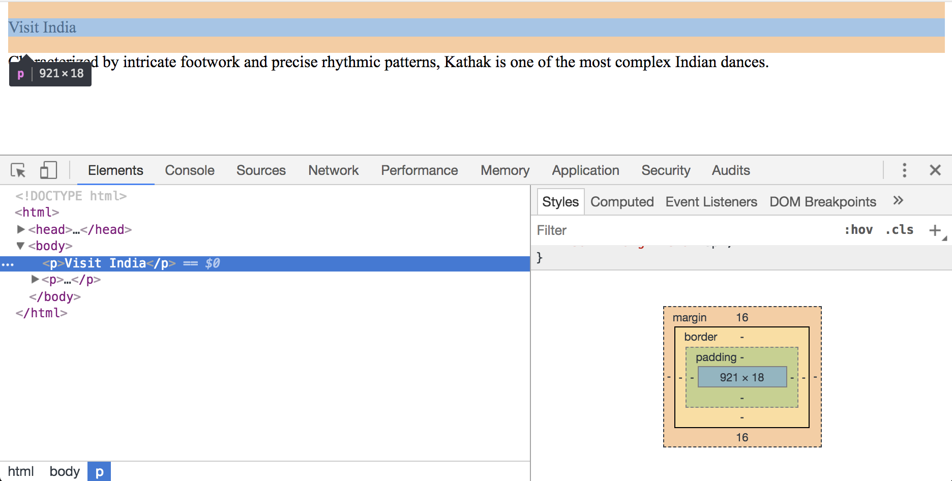
Chrome inspector with box model

Display Options

  • block layout - takes up the full line
  • inline layout - size is based on content
  • flexbox - display multiple elements in a row or column
            
              .container {
                display: flex;
              }


Lorem Ipsum

Referred to as "dummy" or "filler" text. Lorem Ipsum is used as a placeholder when styling a layout with text. Visit lipsum.com to generate Lorem Ipsum.

List of Articles (html)

Below the intro section, add the following container:

            
              <section class="article-list"></section>


Center the List of Articles (css)

Let's make the container visible and center it on the page.

            
              .article-list {
                background-color: pink;
                height: 800px;
                width: 500px;
                margin: auto;
              }


Add an Article (html)

Visit https://www.lipsum.com


Best Florida Beaches

June 4, 2018


Generated Lorem Ipsum...

Style the Article (css)

Remove the temporary background color and add a background color to each article.

            
              .article-list {
                height: 800px;
                width: 500px;
                margin: auto;
              }

              article {
                background-color: white;
              }


Style the Article (css)

Add whitespace around the article text.

            
              article {
                background-color: white;
                padding: 20px;
              }


Style the Article Title (css)

Style the article title to be larger and bold.

            
              article h2 {
                font-size: 20px;
                font-weight: bold;
              }


Style the Article (css)

Add whitespace above the list of articles.

Add whitespace around the list of articles.

            
              .article-list {
                width: 800px;
                height: 800px;
                margin: auto;
                margin-top: 80px;
                padding: 0 40px.
              }


Add Another Article (html)

Separate the Articles (css)

Add space between each article.

Add space around the article.

            
              article {
                background-color: white;
                margin-bottom: 60px;
                padding: 20px;
              }


Responsive Articles (css)

Remove the set width and height

Limit the article's max-width

            
              .article-list {
                margin: auto;
                margin-top: 80px;
                padding: 0 40px;
                max-width: 900px;
              }


Link "Posts" to Articles (html)

Responsive Websites

Media queries set specific CSS rules based on the screen size.

For example, the following code says "For any screen that is 800px wide, or less, apply these styles".

            
              @media only screen and (max-width: 800px) {
                p {
                  color: red;
                }
              }


(800px is a width that covers most tablets and smart phones.)

Responsive Intro

Don't show the image on browsers of a certain width.

            
              @media only screen and (max-width: 800px) {
                .split-layout-container {
                  height: 500px;
                }

                .split-layout-media {
                  display: none;
                }

                .split-layout-content {
                  background-color: #828170;
                  height: 500px;
                  width: 100%;
                }
              }


Congratulations!

You did it! You've learned how:

  1. websites are built
  2. to write content for a website (HTML)
  3. to style a website (CSS)
  4. to publish a website!
gif with an adorable otter

Please let us know how it went!

Be on the look out for an email with a short survey.

Next Steps

What would you like to learn next?

Visit the Resources page for inspiration.