Intro to Web Development
Today
- Review
- Start building your personal website
Let's Review...
CSS Selector Types
- Type Selectors - selects HTML by tag name
- Class Selectors - selects HTML by class name
- ID Selectors - selects HTML by ID name
              p {
                color: red;
              }

              .my-class-name {
                color: blue;
              }

              #my-id-name {
                color: purple;
              }
CSS Box Model
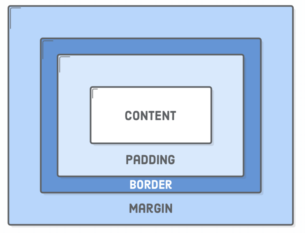
Image from internetingishard.com
Applying New Skills
We re-created the following section from the turing website.

Image from turing.io
<div> is for Division
The <div> HTML container element is used to group other HTML elements together.
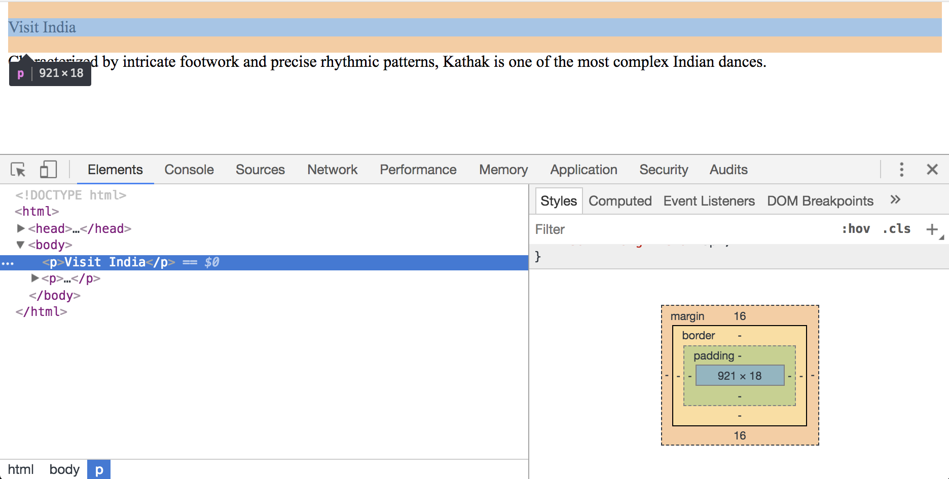
Using the Inspector
To open the inspector, right-click on the website and select "inspect".
Build a Website
Part of building a website includes ensuring everyone can access the website. For this, we'll need to use a company that offers web hosting.
Web Hosting
A service that stores all the necessary files to render your website. This includes the HTML and CSS files.
- HostGator
- DreamHost
- Wix - user-friendly editor
- Squarespace - user-friendly editor
Web Hosting
For our final project, we'll use the web hosting service Neocities.
Why neocities?
- Free
- In-browser HTML editor
- Easy to save and view changes
Neocities - Getting Started
Visit neocities.org to create an account.
Explore Neocities
Neocities offers an HTML tutorial
Let's Get Started
Clear out the existing HTML but keep the HTML structure.
              <!DOCTYPE html>
              <html>
                <head>
                  your-website-name

                </head>

                <body>
                </body>
              </html>
Set the browser tab Title
              <head>
                your-website-name
              </head>
Assess the Layout
Focusing on the top portion of our website, we have a vertical split. Ignoring the content for now, let's focus on building this layout.
Getting Started
- Create a generic container using a div.
- Add a class so we can style it with CSS
              <body>

              </body>
Style the empty container (css)
- Set the container to span the full height and width of the browser.
- Add a background color so we can see our changes
              .split-layout-container {
                height: 100vh;
                background-color: purple;
              }
The "vh" unit stands for "viewport height". The viewport height is the height of the browser's window, which across laptops, tables, and phones.
Introducing Flexbox
So far, we've discussed two ways elements take up space on a page: block layout and inline layout. For advanced positioning, we're going to use a third layout option called: Flexbox.
A flexbox layout consists of a flex container that holds flex items. These flex items can "flex" their sizes, growing to fill unused space in the container, or shrinking to avoid overflowing.
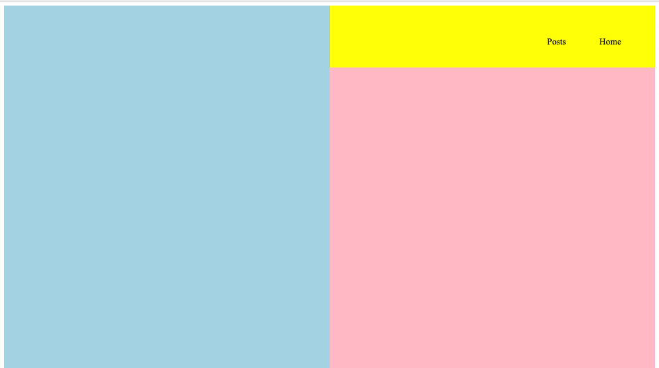
Create the vertical split (html)
- Add two containers, one for the image, one for the text
              <body>


              </body>
Create the vertical split (css)
- Add two containers, one for the image, one for the text
              .split-layout-container {
                display: flex;
                height: 100vh;
                background-color: purple;
              }

              .split-layout-media {
                background-color: lightblue;
                width: 50%;
              }

              .split-layout-container {
                background-color: pink;
                width: 50%;
              }
Add the Navigation Text (html)
A large number of sites use "lists" to create their navigation or footer as these section are a collection of links.
Turn the Nav Text into Links (html)
Wrap each list item in a link (aka, anchor tag):
Style the Nav (css)
Remove the bullet point icon
Remove the blue color and underline
Style each list item to be on the same line
Nav is on the right-hand side of the page
              .navigation-list {
                list-style-type: none;
              }

              .navigation a {
                color: black;
                text-decoration: none;
              }
Style the Nav (css)
Place each list item to on the same line
Nav is on the right-hand side of the page
              .navigation-list {
                display: flex;
                flex-direction: row-reverse;
                list-style-type: none;
              }
Style the Nav (css)
Create space between each list item
Create space around the navigation links
              .navigation {
                background-color: yellow;
                padding-top: 40px;
                padding-bottom: 20px;
              }
Side-note, the background color is temporary and will help us see the padding that surrounds the nav element
Current state of our website
Add the Intro Content (html)
Below the nav, let's add a container (div). Within that div, add the intro text.
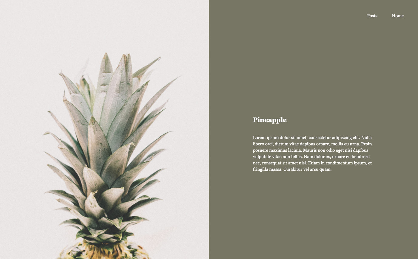
                Pineapple


                  Lorem ipsum dolor sit amet...
Visit lipsum.com to generate dummy text, also known as Lorem Ipsum.
Intro Content (css)
Centering an element, vertically, can be tricky business. However, we can use flexbox to make it easy. Revisit the "split-layout-content" CSS class and set the layout to use "flex".
              .split-layout-content {
                background-color: pink;
                width: 50%;
                display: flex;
              }
Intro Content (css)
The flex layout defaults to placing elements in a row. In our case, we want a column layout.
              .split-layout-content {
                background-color: pink;
                width: 50%;
                display: flex;
                flex-direction: column;
              }
Intro Content (css)
Not much has changed but changing the layout of the parent container will help the "intro" container position itself vertically. Let's vertically center the intro container.
              .intro {
                display: flex;
                flex-direction: column;
                height: 100%;
                justify-content: center;
              }
Intro Content (css)
Add space around the text
Limit how much space the text can occupy
              .intro {
                display: flex;
                flex-direction: column;
                height: 100%;
                justify-content: center;
                max-width: 500px;
                padding: 0 50px;
              }
Intro Content (css)
Add space between each line of text
              .intro {
                display: flex;
                flex-direction: column;
                height: 100%;
                justify-content: center;
                max-width: 500px;
                padding: 0 50px;
                line-height: 1.5;
              }
Update the background colors (css)
Remove the pink and yellow background colors
Set the green background color
Below is the updated CSS with the green color:
              .split-layout-content {
                background-color: #828170;
                display: flex;
                flex-direction: column;
                width: 50%;
              }

              .navigation {
                padding-top: 40px;
                padding-bottom: 20px;
              }
Update the font color (css)
Update the navigation links and the intro text to use the color white. Below is the updated CSS:
              .navigation a {
                color: white;
                text-decoration: none;
              }

              .intro {
                color: white;
                display: flex;
                flex-direction: column;
                height: 100%;
                justify-content: center;
                line-height: 1.5;
                max-width: 500px;
                padding: 0 50px;
              }
Remove white border (css)
Remove the white border around the page
              body {
                margin: 0;
              }
Font Improvements (css)
Set the font family
Set the font size
              body {
                font-family: Georgia, Arial, sans-serif;
                font-size: 18px;
                margin: 0;
              }
Add an Image (html)
Visit Unsplash for high-quality, free images.
A tall image will work best.
Once you found an image you like:
- Download the image
- In Neocities, use the upload button to upload the image
Add an Image (html)
Update the existing HTML for "split-layout-media" and add a nested image tag to reference the recently uploaded image.

Add an Image (html)
Position the image:
              .split-layout-media img {
                height: 100vh;
                object-fit: cover;
                width: 100%;
              }
Final HTML & CSS
Current State of our Website
Final HTML
If you copy from below, update the image name to match the name of the image you uploaded to Neocities.
<!DOCTYPE html>
<html>
<head>
Pineapples
</head>
<body>
Pineapple
Lorem ipsum dolor sit amet, consectetur adipiscing elit. Nulla
libero orci, dictum vitae dapibus ornare, mollis eu urna. Proin
posuere maximus lacinia. Mauris non odio eget nisi dapibus vulputate
vitae non tellus. Nam dolor ex, ornare eu hendrerit nec, consequat
sit amet nisl. Etiam in condimentum ipsum, et fringilla massa.
Curabitur vel arcu quam.
</body>
</html>
Final CSS
              body {
                font-family: Georgia, Arial, sans-serif;
                font-size: 18px;
                margin: 0;
              }

              /* Intro Section */

              .split-layout-container {
                background-color: purple;
                display: flex;
                height: 100vh;
              }

              .split-layout-media {
                background-color: lightblue;
                width: 50%;
              }

              .split-layout-media img {
                height: 100vh;
                object-fit: cover;
                width: 100%;
              }

              .split-layout-content {
                background-color: #828170;
                display: flex;
                flex-direction: column;
                width: 50%;
              }

              /* Nav Section */

              .navigation {
                padding-top: 40px;
                padding-bottom: 20px;
              }

              .navigation-list {
                display: flex;
                flex-direction: row-reverse;
                list-style-type: none;
              }

              .navigation a {
                color: white;
                text-decoration: none;
              }

              .navigation li {
                padding-right: 60px;
              }

              .intro {
                color: white;
                display: flex;
                flex-direction: column;
                height: 100%;
                justify-content: center;
                line-height: 1.5;
                margin: 0 auto;
                max-width: 500px;
                padding: 0 50px;
              }